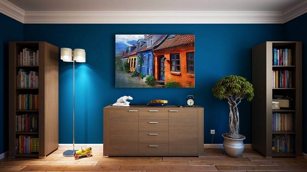
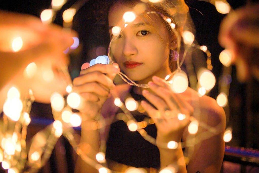
 This year for the first time in its history, Pantone chose not one but two colors, Rose Quartz and Serenity. Why two? Because they said, the two colors reflect the duality of the times. One cool color and one warm color. The two means connection, balance, order and peace.
The color of the year often reflects society. As instability continues to increase around the world, Pantone suggests that these pastel colors represent what we crave for in society today. Yes, I do believe we all want to feel a connection with our family, friends and society, we all want wellness, and we all want a balance in life.
When I see these colors, Rose Quarts and Serenity, I would describe them as lightly gray muted pastel pink and pastel blue. From a Yin-Yang perspective, being pastels, they are yin colors.
The energies I receive from are feminine, soft, and gentle yin energies. They hold back and aren’t crying for attention. They are happy to be in the background. Yet, they are there.
In this age where everything is shared in an instant on social media, many people like to push the envelope to grab attention. The last few years the colors were bold and dark. As this year’s colors suggest, maybe it’s time to dig a little further, and check out what’s in the background. It may not be shocking news, but maybe it’s something that makes us feel softer, kinder, and more human.
Although, I can’t see myself using these colors as accents to interiors, I think I like this year’s colors as simply for what they represent.


